The Research Journey of the Atmaikya Logo
The Research Journey of the Atmaikya Logo
A Symbol of Alignment, Unity, and Return to the Self
1. The Origin: Understanding the Essence of Atmaikya
The logo creation began not with sketches, but with silence.
The word Atmaikya is derived from two Sanskrit roots:
- Atma — the soul, the true self, the eternal consciousness
- Aikya — unity, oneness, union
Together, Atmaikya represents the union of the individual self with its highest truth.
This was not just a brand. It was a state of being.
The logo needed to embody:
- Inner alignment
- Spiritual awakening
- Emotional healing
- Energetic balance
- Return to wholeness
The objective was clear: create a symbol that feels like coming home to oneself.
2. The Symbol Research: Universal Patterns of Alignment
To represent unity and alignment, research explored symbols that transcend culture and time.
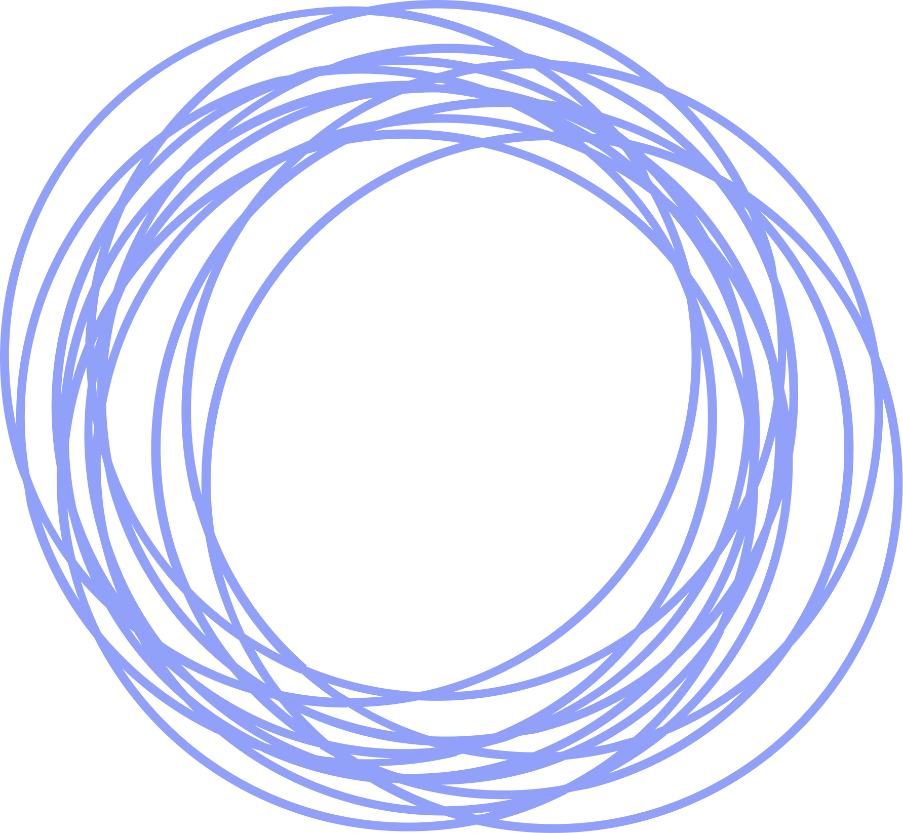
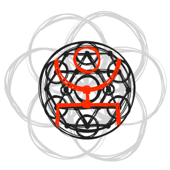
Sacred Geometry
Sacred geometry became the foundational inspiration because it reflects the mathematical order of consciousness and the universe.
Key geometries studied included:
- The circle — symbol of wholeness and infinite existence
- The point — symbol of origin and pure awareness
- The golden ratio (1.618) — nature’s harmony and perfect proportion
- The Fibonacci sequence — the natural expansion of life
These patterns exist everywhere: galaxies, shells, flowers, and even human DNA.
They represent alignment without force. Growth without distortion.
This perfectly mirrored Atmaikya’s healing philosophy.
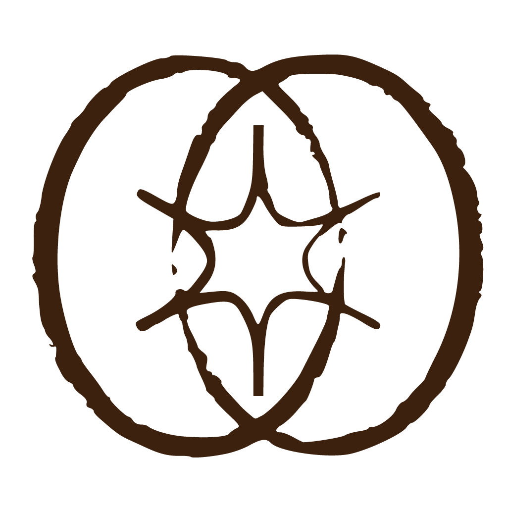
3. The Letter “A”: The Portal of Awakening
The research then focused on the first letter: A.
“A” is universally symbolic:
- The beginning
- The origin
- The first expression of existence
- The emergence of consciousness
In Sanskrit vibration, the sound “A” is the first sound from which all others emerge.
This made the letter “A” not just a typographic choice, but a spiritual portal.
The logo would begin here.
4. Fibonacci Integration: Aligning with Natural Intelligence
Rather than constructing the letter “A” arbitrarily, it was built using the Fibonacci sequence.
This ensured:
- Natural visual balance
- Subconscious harmony
- Effortless visual flow
The proportions mirror growth patterns seen in nature, making the logo feel instinctively aligned.
5. Minimalism: Removing Noise, Revealing Truth
Modern spiritual seekers are not drawn to complexity. They are drawn to clarity.
The logo research embraced minimalism to reflect:
- Stillness
- Presence
- Awareness
Every unnecessary element was removed. What remained was pure structure and pure intention.
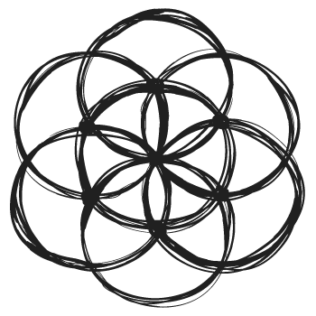
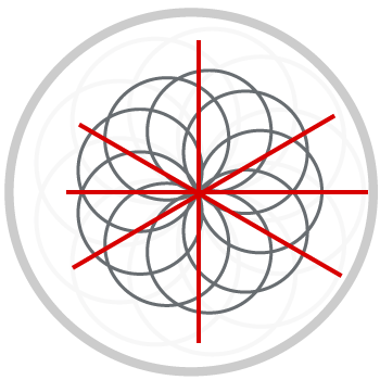
The Flower of Life: The Blueprint of Creation
Inspired by the teachings of The Flower of Life, the logo research explored sacred geometry as the blueprint of existence itself.
The Flower of Life represents creation expanding from unity while never leaving it. Each circle symbolizes individuality, while every intersection symbolizes connection.
Atmaikya does not create unity — it reveals the unity that was never broken.
Final Brand Statement
![]()
The Atmaikya logo was not designed. It was discovered.
Discovered in the patterns of nature.
Discovered in the structure of consciousness.
Discovered in the silent truth that unity has always existed within.
Atmaikya is not something you become.
It is something you remember.
Align. Heal. Become.